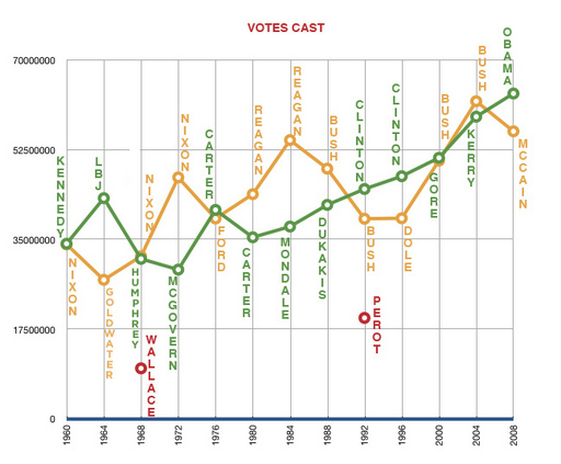
The population of the US has followed pretty much that exact same slope, so this graph makes sense.
Anonymous
said...
Yes, it'd be interesting to see a similar graph showing the percent of eligible voters who turned out for each election, with breakdowns by party. I read recently that 2008 had the highest percentage since JFK.
Joe said it would be interesting to see a similar graph showing the percent of eligible voters who turned out for each election with breakdowns by party.
i calculated just that... and will be posting it on our site shortly.
the graph looks much the same with only a few notable exceptions.
that is, if i did the math correctly. ha
raul
said...
Here are some graphs I'd love to see:
1. A state by state map of the electoral votes/margin of victory. The states with the the largest number of votes/smallest margin of victory would show, I think, what states were actually the most valuable in this election.
2. A graph of the margins of victory over time.
3. A graph of population vs total votes cast over time.
Anonymous
said...
anonymous - ill try to get on that.
in the meantime... the new graph is up on www.memeticians.com
james commented on our post asking for even more data.
ill be uploading that soon with some stuff beyond his request.
Anonymous
said...
Your graph is very deceiving. There was almost no increase in eligible voters compared to 2004.
"Americans set a record for number of votes cast in this presidential election but failed to make history with the percentage of voter turnout, experts said.
Curtis Gans, director of American University's Center for the Study of the American Electorate, said Thursday that percentage turnout was lower because Republicans stayed away from the polls.
Disappointment over Sen. John McCain's choice of Alaska Gov. Sarah Palin as his running mate, combined with a perception that the ticket would lose, prompted many would-be Republican voters to ditch the polls on Election Day, Gans said"
I don't see how showing a graph of actual votes cast is deceptive, it's a presentation of fact. And there was no analysis to color the interpretation of it...
This said, a graph of voter turnout is also interesting as it shows different things...
If you look at gerard's graph linked above which shows votes cast as a % of eligible voters you see that republican turnout is near historical averages (a bit lower than 2004 but much higher than 1992-2000). Democratic turnout was very high compared to historical averages (in the last 50 years only 1964 has been higher.... Also fascinating is his second page of graphs which show Votes Cast as % of total eligible voters.
That graph is probably the best indicator of interest in the election and it shows that no elections since the ones in 1960/64 have generated similar levels of interest.
Comments:
The population of the US has followed pretty much that exact same slope, so this graph makes sense.
Yes, it'd be interesting to see a similar graph showing the percent of eligible voters who turned out for each election, with breakdowns by party. I read recently that 2008 had the highest percentage since JFK.
Interesting. I had no idea Nixon and Reagan won by such huge margins.
The other interesting thing is how linear the democratic line is...
I was born in 1988. I've only known Clintons and Bushes in the white house. Can't tell you how exciting it is to have elected Obama!
Goes to show just how unlucky Kerry was.
Joe said it would be interesting to see a similar graph showing the percent of eligible voters who turned out for each election with breakdowns by party.
i calculated just that... and will be posting it on our site shortly.
the graph looks much the same with only a few notable exceptions.
that is, if i did the math correctly. ha
Here are some graphs I'd love to see:
1. A state by state map of the electoral votes/margin of victory. The states with the the largest number of votes/smallest margin of victory would show, I think, what states were actually the most valuable in this election.
2. A graph of the margins of victory over time.
3. A graph of population vs total votes cast over time.
anonymous - ill try to get on that.
in the meantime... the new graph is up on www.memeticians.com
hopefully it is what you were looking for joe.
this is the actual link for gerard's graph: http://www.memeticians.com/2008/11/a-little-historical-perspectiv.php/
thanks anonymous.
james commented on our post asking for even more data.
ill be uploading that soon with some stuff beyond his request.
Your graph is very deceiving. There was almost no increase in eligible voters compared to 2004.
"Americans set a record for number of votes cast in this presidential election but failed to make history with the percentage of voter turnout, experts said.
Curtis Gans, director of American University's Center for the Study of the American Electorate, said Thursday that percentage turnout was lower because Republicans stayed away from the polls.
Disappointment over Sen. John McCain's choice of Alaska Gov. Sarah Palin as his running mate, combined with a perception that the ticket would lose, prompted many would-be Republican voters to ditch the polls on Election Day, Gans said"
http://www.cnn.com/2008/POLITICS/11/06/voter.turnout/index.html#cnnSTCOther1
I don't see how showing a graph of actual votes cast is deceptive, it's a presentation of fact. And there was no analysis to color the interpretation of it...
This said, a graph of voter turnout is also interesting as it shows different things...
If you look at gerard's graph linked above which shows votes cast as a % of eligible voters you see that republican turnout is near historical averages (a bit lower than 2004 but much higher than 1992-2000). Democratic turnout was very high compared to historical averages (in the last 50 years only 1964 has been higher.... Also fascinating is his second page of graphs which show Votes Cast as % of total eligible voters.
http://www.memeticians.com/2008/11/even-more-graphs.php
That graph is probably the best indicator of interest in the election and it shows that no elections since the ones in 1960/64 have generated similar levels of interest.