November 9, 2004
Squeaker
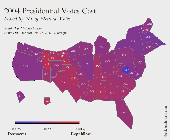
To my European friends who look at our red/blue electoral maps on CNN and think we are all right wing rednecks, I offer this graphic by Jeff Culver at the University of Washington. It shows a US map proportional to it's electoral votes (and hence roughly proportional to population) and shaded by the intensity of the vote. This election was awfully close, in most places that matter... a landslide only in the eyes of someone who lost the popular vote last time and then declared victory.
This page by some folks at the University of Michigan offers a few more interesting cartograms.
Robert Vanderbei of Princeton also has some informative election maps.
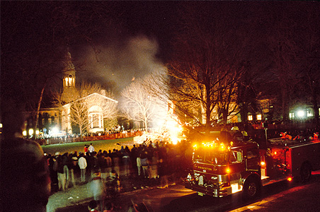
Speaking of Princeton. This was the scene November 1986, 18! years ago:


Add your thoughts: